Sonic Fountain, the centerpiece of Doug Aitken’s show (all works 2013) includes a large, round hole jack-hammered into the cement floor and filled with water. From above, a system of pipes with five spigots drips water into this small pool. The drops fall in programmed rhythms and are doubled with recorded water sounds. Each splash is synchronized with more synthetic and resonant recorded splashes, as if they were reverberating in a cave. Nearby sits a pile of excavated rubble.
The overall effect is perversely theatrical and yet formally awkward, with the five spigots arrayed like corners of a square and one in the center. The rhythm of the drops is predictably regular and yet irritatingly unmusical in a way that calls to mind someone practicing rudimentary beats on a drum. The synthetic sounds are both cheesy and redundant, yet manage to make the physical drops sound, by comparison, oddly banal (reminiscent of toilet splashes, sadly.) Likewise, the atmospherics make the laborious excavation seem relatively puny and prosaic. The whole thing cancels itself out. Oddly, it is also suspiciously similar to a more successful piece—Untitled (2011) from Jim Hodges’ 2011 show at Barbara Gladstone—in which Hodges made a nearly identical hole and rigged a disco ball to gradually lower itself from the ceiling until submerged.
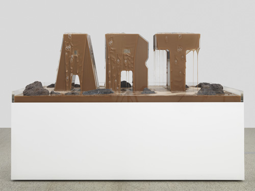
Aitken’s other sculpture here, Fountain (Earth Fountain), (2012) is blatantly derivative of a more famous work. In a large rectangular vitrine the letters “A-R-T”, built from Lucite, ooze smooth creamy mud resembling milk chocolate. It immediately recalls Robert Rauschenberg’s Mud Muse (1971)—itself a large rectangular vat filled with mud rigged to bubble and sputter like lava. The use of the word “ART” here merely underlines one obvious subtext of Rauschenberg’s piece: that something as ubiquitous and abject as mud could so effectively be corralled into the realm of art. This makes Aitken’s rather polished version more like CliffsNotes for a canonical work than anything else.
Here’s an even more tired trope: holes punched in gallery walls. While this device can be effective (if not subversive, as in the works of Gordon Matta-Clark) it’s become such a cliché that, at this point, Aitken’s version feels merely decorative. What’s worse, the holes are just-so: neatly cut through both layers of sheetrock with the interstitial space casually patched with cement and painted over. This creates the unconvincing impression of a rough but perfectly circular hole, over 8-feet wide, somehow spontaneously punched through a thick concrete wall. The large text pieces framed by these holes and situated a few feet behind them—Sunset (Black) and 100 YRS—are jokey, slick and elegant in ways that seems more like edgy design than art.
Another text piece, MORE (Shattered Pour), is made from faceted planes of mirrored glass spelling “MORE” with wet-looking broken mirrors coated in resin scattered in each letter’s convexity. It might seem custom-made to satirize art-market acquisitiveness except that its anodyne quality could just as easily play into it. Either way, it’s a nice looking object, but the viewer is left wanting, well… more.
Doug Aitken

Doug Aitken, Fountain (Earth Fountain), 2012, Reeves, Courtesy The artist and BravinLee programs, New York

