


Deep in the Los Feliz hills of a more verdant Los Angeles, during the Civil Rights movement, Corita Kent spread messages of joy and feminine power through her art. “Corita,” as she became known, is widely known for her colorful serigraph prints which called for love and justice. These prints, with meticulously rendered letters in the style of contemporaneous advertisements and signs, were her own Pop Art evolution of the typographic reverence paid by Medieval illumination; meditations on the decoration of letters to emphasize the divine message of a word.
But Corita’s rarely seen photographic archive, presented in the Marciano Art Foundation (MAF) Theater Gallery, reveals an expansive and influential art practice beyond the graphic works for which she has become synonymous.
A three-channel loop of 1,100 digitized 35mm slides taken from 1955 to 1968 bring into sharp focus Corita’s impact as head of the art department at Immaculate Heart College. Art happenings cum religious ceremony abound in the form of buoyant processions with themes like “POWER UP” and “Challenge to Change,” bolstered by signs, hats, kites, and puppets that required months of collective artmaking. Images of one particularly psychedelic procession almost akin to Yayoi Kusama’s art. Taking over the streets of Los Angeles to celebrate the power of the feminine during Mary’s Day, hundreds of women held hundreds of vertical banners painted with polka dots in pink and blue, yellow and black, orange and black, white and yellow.
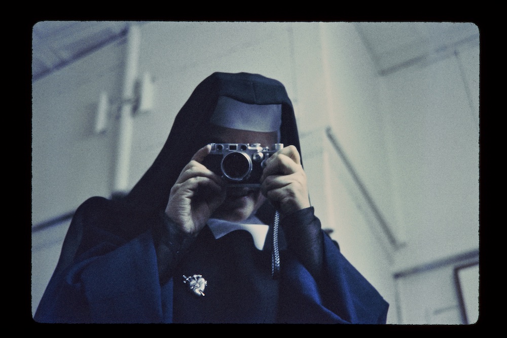
Sister Magdalen Mary, Morris Gallery, New York, 1959, 35 mm slide, Corita Slide Collection, Corita Art Center, corita.org
There are images of field trips she hosted for students to meet her art-world friends and fans, like Charles and Ray Eames and Buckminster Fuller. In one particularly memorable snap of Charles Eames, he swings through the image horizontally on a simple foothold rope in his iconic Eames House, beaming at the photographer behind the camera with a huge, childlike smile on his face. The image perfectly captures why he and Corita must have gotten along so well; two individuals filled with abundant joy and the capacity to translate it through their art.
Slides upon slides appear as a visual poem, revealing the staggering mass of art she created in community, from wearable art to found object sculptures to her own graphic prints that eventually became fine art.
They highlight her delight in the common place and every day, an inspiration foundational to her practice: the landscape of LA as seen through its hand-painted retail signs on billboards and storefronts that acted as source material for her own artworks; parking stubs stuffed under a windshield wiper; women’s fashion; and self-portraits of herself and friends in mirrors.
So strong was her instinct to capture Los Angeles and Angelenos through a photographer’s lens that she was the unofficial photographer for the Irregular Bulletin–the art department’s sporadically published newsletter between 1956-1963, and the subject of a satellite exhibition in the MAF Library highlighting its innovative design. Arguably the original punk zine, text placed in every direction required the reader to constantly reorient him or herself to receive the messages at hand, and on every page, fonts of all shapes and sizes appeared alongside collaged photographic and commercial images to report on recent art department activities. The weathered pages of the Bulletins on view are the only clue they aren’t contemporary examples of zines we see at Printed Matter’s L.A. Book Fair every year, but precursors about 70 years old.
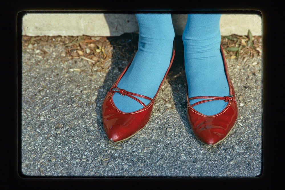
Untitled, Red Shoes, Los Angeles, 1967, 35 mm slide, Corita Slide Collection, Corita Art Center, corita.org
A series of prints from 1968 take up a lot of wall space in the lobby; a cacophony of neon posters inspired by the Ringling Museum of Circus in a P.T. Barnum-like typeface offering quotes about love and political freedom from a variety of prominent thinkers, musicians, and philosophers.
Beyond this installation of prints that deviate somewhat from her typographical aesthetic, there is only one “classic” Corita print on view, nestled in the Marciano’s permanent collection. It features most of the core elements we expect to see in a Corita print, including bright colors; a statement of fierce optimism; a variety of fonts including her handwriting, a reference to a commonly encountered sign, and highly flourished text; text in reverse; and a quote from a celebrated thinker. “I care. I care about it all,” it declares, in her handwriting, within a green half-moon at the top of the print. In the center of the print, text usually seen in an LA sign directing drivers to a freeway entrance in bright pink is layered under the words “highly prized” in purple, legible only after special attention is paid to decipher the partially obscured and mirrored letters. At the bottom of the print, another half-moon block of color in orange holds a quote by Lorraine Hansberry, the first African American female author to have a play performed on Broadway, referring to the ideas of care and political insurgency. It would have made the exhibition feel more complete to see more of Corita’s prints, especially any of the prints seen in so many of Corita’s photographs.
Harnessing the modern art languages of her time to amplify the growing movements for justice and peace, Corita set an example for a community of women across Los Feliz, Los Angeles, and, eventually, generations. Artists like Barbara Kruger and Andrea Bowers followed in her wake, using the power of art to spread radical messages of love and resistance in times of war and unrest with their own contributions of everyday wonder.
