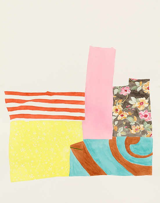
Periodically, we hear complaints (or alternatively, sighs of gratitude) from one quarter or another that painting is dead; or sometimes more specifically, that abstract painting is dead. At this point it’s far more likely the planet will die before abstract painting. Not exactly the cheeriest thought – but I get it. Today, as we face hard realities pitched somewhere between the Alien and Scary Movie franchises, artists appear once again to be veering in an abstract direction. The difference is a certain material specificity that connects with motive, while both deconstructing or dissolving that materiality and transposing or reconfiguring it into something entirely different – not a new ‘reality’ exactly, but a device suggesting something about one reality and another yet to be determined. I’m not sure Cindy Bernard would even characterize this work (most of which was originally conceived some time ago, and another body of work executed between 1988 and 1983) as abstraction – its constituent parts might be more easily categorized as ‘pattern and decoration’ – but in their various fragmentations, juxtapositions, reconfigurations, and placement, they construct a fresh syntax of relationships, correspondences, and color harmonics. That we ‘read’ certain elements as flowers, symbols, patterns, etc., only augments the power of their abstraction. Many of the fragments were directly inspired by a relative’s quilts. Here, liberated from their domestic ‘grids,’ and recomposed amid varicolored stripings and rhombi, verticals, and other geometric swaths of solid color (or gray), or simply isolated eccentrically in their white paper fields (all works in watercolor and graphite on paper), they assume an entirely different character – a ‘reality’ we can’t name, but recognize nonetheless. Color and pattern here are a kind of seduction – the flirtation that provokes a conversation of longer duration. In her Security Envelope Grids, Bernard took an entirely different approach, photographing and enlarging the subject security grids (though they have a distinctly graphic, ink-heavy look in their uniform black frames). Here the densely woven patterns and hatchings of logos and trademarks broadcast power (of branding, corporate agency, and sheer political/economic leverage) as well as protection, while Bernard alludes to their extensions into the more eccentric mesh of communities and individual lives.
Richard Telles Fine Art
7380 Beverly Blvd.
Los Angeles, CA 90036
Show runs thru June 24, 2017


