


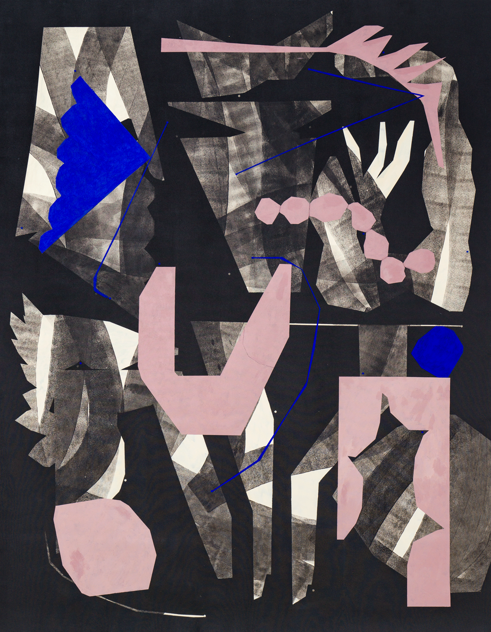
Already known for planting her cut-out shapes onto a dense matte black ground, which she has characterized as ‘non-space,’ for this show, Kent challenges viewers straight off with a plunge into a black field already seemingly torn away to reveal both apparent voids alongside ‘cut-out’ figures in white that echo the more prominently placed pigmented shapes, and—further confusing her ‘non-space’—shallow, quasi-illusionistic depths in which undulant and organic segmented forms in gauzy charcoal-grays seemed to emerge from behind the deep-black torn-out surround like protozoa or plant stalks, only to sink again behind interior black shards and stalactites.
Dead center floats a peachy-pink decagonal U-shaped piece of joinery (or conceivably upswept limbs), echoed by three dead-white digits fluttering above out of the black, seemingly poised to intercept an indigo-blue shuttlecock (or stealth bomber) shape to the left (‘guided’ by interstitially floating blue rays or ‘wands’), all beneath a feathery palm frond shape top center.
Between ‘U’ and frond, a swag of seven pink ‘pebbles’ floated, echoed by a larger pebble shape at lower left and a torn-out rectangle in pink standing on the right, as if a cat had plunged through to the ‘floor’ beneath.
The title is Penning one’s insights (all works 2020), which may well constitute an advisory in recondite twin-speak. Kent, an identical twin, has alluded to a secret language/communication she shared with her twin, which I take the liberty here of interpreting as an advisory imperative not to make any assumptions about what lies beneath that black ‘non-space.’
Caroline Kent, Penning one’s insights (2020). Courtesy Kohn Gallery
Between the surface markings and less-than-uniform, occasionally interrupted matte-black ground, Kent gives some indication of her process. Some of it is a quasi-directional mapping, useful to the extent we read the paintings as visual poetry. The finality of the works seems tenuous, in that there are frequent superimpositions not simply of subsidiary patterns or textures, but shapes within shapes.
Some of these are directional, like the horseshoe gray arch with a sequence of linked orangey-red triangles in Musings on how to leave and re-enter (which not incidentally points in the direction of a gray ‘chrysallis-coffin’). Some of these oscillate between geometrics and organic, or even lexicographic, shapes.
Kent’s orchestration of her imagery encompasses its possible inversions — the pale aqua ‘V’ against the putty-colored ‘animal head;’ the beady textured serpent crawling across the pale sea-foam ‘R.’
The all-over quality of this kind of patterning is itself a check against a locked-in ‘read’ of the imagery, notwithstanding the relative legibility of the more Matisse-like papier collé forms (e.g., compote and fruit, dog/chair, necklace, etc.) Claw-like ‘fingers’ grasp a Duchampian ‘bride’ shroud in A slow turning of events; but there is far more than an alchemical exorcism going on. The title alone reflects Kent’s insistence on her own willful play not simply with shape, color, and composition, but with time itself.
