


Yunhee Min’s work at Susanne Vielmetter Los Angeles Projects last summer follows an earlier body of work similar in style, “Movements” at her New York gallery in 2016. Both of them mark a strong new direction for her painting. The new series, entitled the “Wilde Paintings,” is so named because the generous natural light in her new DTLA studio—located on a street in the fashion district named for Oscar Wilde—served as inspiration for the work.
The statement accompanying the exhibition quotes Wilde: “Art is useless because its aim is simply to create a mood.” This quote was not to be taken seriously—for Min, the light in her studio was as important as the acoustics would have been for a sound recording; it affected the character of the paintings and established a mood for their development. Yet the paintings themselves take us beyond mood into a potent pictorial space, where color, light and painting constitute a stronger force.
Min’s new paintings, like the earlier Movements paintings, draw the viewer into them with an ease emanating from her method—broad, bold, thinly applied swaths of rich color, each bearing a clear singularity while delicately blending and mingling with their neighboring color. There is an enigmatic balance to the paintings between a light delicacy of application, and a powerful length and velocity to the strokes—evidence of a greater effort.
The salient quality that emerges is a pure display of color that is vivid and striking—as large as the body of the viewer—standing alone as the painting’s statement while softening the effort that it might have taken to get there. The parallel striations and modulations of the paint strokes record, like a seismograph, the hand of the artist and the feel of the act of painting them, yet there is an effortless quality to the result. The presence of the artist is transmuted into the stroke but screened into the background, embedded in the work like DNA.
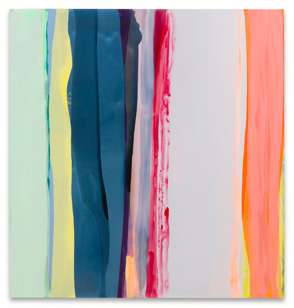
Wilde Painting 5,” 2018, Acrylic on linen
72 x 76″ [HxW], courtesy artist and Susanne Vielmetter Los Angeles Projects, photo by Jeff McLane
Her palette is a mixture of airy pastels, occasional strokes of Day-Glo, touches of intensely warm or intensely cool mid-tone colors and a few darker grayish muted shades that anchor the others. The paintings are made with a squeegee so there is a quietly smooth uniformity in them that calms the paint and frees up the colors to act with a purer aesthetic power.
The visual force of these paintings is considerable. I find that when I stand in front of them, close enough to fill my visual field, the color was the form, the content and the message—a cogent statement about the freedom that painting has to jettison everything except the most direct, essential thing.
The work is reminiscent of the early abstract expressionist work of Morris Louis, who poured paint and let it flow down the canvas in bands of color from an older more muted palette. Lest we forget, it was these paintings of Louis along with the more graphic work of Kenneth Noland that served as a starting point in 1960 for Clement Greenberg’s formalist discourse on the flatness of the picture plane, taking Abstract Expressionism to the next logical step by examining the intrinsic nature of color field painting. What was missing from the discourse on abstraction, Greenberg asserted, was awareness of the flatness of the canvas picture plane, a blind spot that Greenberg asserted dated all the way back to the Renaissance.
This claim was thinly supported with a teleological assessment of Renaissance painting as having naively hidden this flatness in Archimedean illusion by inviting the viewer into a vertical, naturalistic space imitating life—thus obfuscating the painting’s flatness.
It took the great iconoclast, critic and expert on Renaissance painting Leo Steinberg to restore some balance to this heady conversation by pointing out that it is absurd to think that Rembrandt was naïve about the nature of painting. Steinberg shifted the argument from Greenberg’s rigid formalist theory about flatness of the picture plane to a fresher perspective drawn from his actual experience in front of a painting when he wrote in his seminal essay “Other Criteria.”
What I have in mind is the psychic address of the image—its special mode of imaginative confrontation and I tend to regard the tilt of the picture plane from vertical to horizontal as expressive of the most radical shift in the subject matter of art, the shift from nature to culture.
That abstract painting could affect the psyche of the viewer, or confront the viewer with the power of the imagination by self-referencing culture, art and painting itself was a profound discovery for modern art and continues to resonate nearly 60 years later.
It is this “special mode of imaginative confrontation” in Min’s work that impressed me because of its phenomenological impact, it also seems to represent a return to the studio where painters have to battle it out with their own instincts and subjective choices rather than farm out their choices and decisions to conceptual strategies. I wanted to know more about how she got there, and how she makes it look so easy, so I decided to pay her a visit.
I met Min at her spacious sky-lit studio on Wilde Street and the light there was as luminous as promised. We sat across from each other at a long table and talked about art and her work. Slender, calm and alert, dressed in work clothes, she projects the same quiet intelligence as her painting. I wanted to know about her method and how she arrived at this plunge into subjective color.
Her earlier work around 2004 followed a conceptual model in which she used only colors of house paints that had been left behind, rejected at the paint store. She was interested in how these colors had been selected by rejection, processed by a cultural filter, and how these socially rejected colors could be transformed by craft—building up layers, sanding, smoothing, blending.
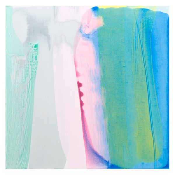
Movements (tides, automatic 3), 2015, acrylic on linen, 45 x 45 in., photo by
Christopher Burke Studios, New York.
Around 2008 her work began to undergo a fundamental change. She became interested in composition and the possibilities of the picture, and began to feel the need to have a more direct relationship with color and painting. Curious about how she chooses her colors, I asked her about color theory, that of Josef Albers for example. “I think everything we know about color, you just absorb that and it becomes intuitive knowledge,” she said. “Ultimately I don’t know if [my color choices] make any sense in terms of ideas we already have. It’s simply you are looking at a moment when these colors are together in this way and it has its own internal relationships, and it simply exists.” Min paints in the moment when the colors simply exist in front of her, external to knowledge and memory, and she responds to this imprint completely absorbed in the present.
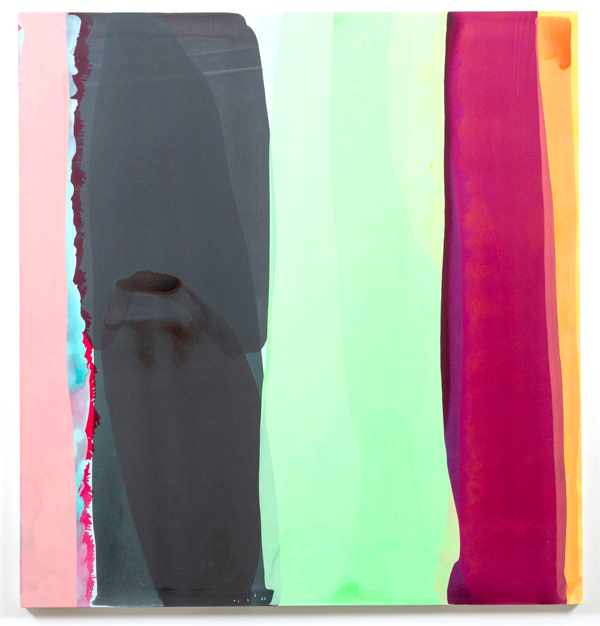
Wilde Painting 6, 2018, Acrylic on linen, 72 x 76″ [HxW], courtesy artist and Susanne Vielmetter Los Angeles Projects, photo by Jeff McLane
I asked her what it takes to get one of these paintings done, and how she goes about it.
She replied, “I’ve been using squeegees for several years now. You can get them in different grades of rubber, soft or hard, and the ones I like are softer. Also you can get them with different nibs, some are rounded, some are pointed, to give different kinds of effects.”
Though shown vertically, the paintings are created horizontally with the stretched linen laid out on a table so she can pour the paint, then pull it along the linen with the squeegee as she walks from one end of the piece to the other.
Her physical reach and her ability to maintain control—but not too much control—determine the size of her work. This unknown territory between control and unpredictability assure that the results are always a surprise. She works on multiple pieces at one time, moving from one to the other as each piece develops and suggests the next step toward completion.
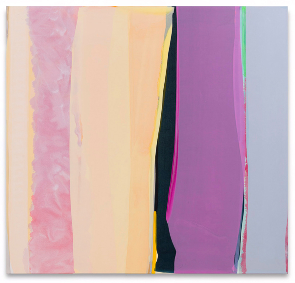
Wilde Painting 1, 2017-18, Acrylic on linen,
72 x 76″ [HxW], courtesy artist and Susanne Vielmetter Los Angeles Projects, photo by Jeff McLane
This is the part that is not as easy as it might appear; it is a process not without angst, internal dialogue, the balancing of considerations, the fear of failure. It’s a winnowing process where she has to leave the work and come back to it, always searching and hoping for what she calls a “little glimpse of freshness.” “It’s exhausting,” she laughed. I pointed out that despite what she went through to get the work done, none of the agony she described seemed to show up in the work. It looks effortless.
Much of the time we spent talking in her studio consisted of me, awkwardly and not entirely coherently, probing her with circuitous questions about subjectivity and painting to see if I could find out what was the basic impulse behind this work. Finally she said this: “The idea of just being able to stand in front of a painting, and just to look at something that is not moving—it’s not doing some fancy trick in front of your eyes, just paint on canvas—seemed radical, seemed important.”
David Salle, in a recent, quite remarkable essay on the work of Terry Winters wrote: “One measure of good artists is that what they do looks easy—once they have done it… [and] we begin to believe—both the manually inclined and those who have never picked up a piece of charcoal—that we could do it too. Alas, most of us cannot.” This would apply to Min’s work as well, but I would tend to agree with Min. I don’t need to know I can do this; standing in front of the painting is quite enough.
