I’m becoming accustomed to conversations changing overnight over the last year or two; and certainly the context of those conversations is being altered more or less continuously. Less expected is when the perceptions of a set of issues or phenomena of any variety – whether social, cultural, environmental – previously more or less settled and rapidly receding in the historical rear window, are suddenly resurrected as if, however resolved or settled, they simply hadn’t quite been dealt with enough care, devotion or rigor. (Is this the domain between theory and physical (or metaphysical) law?)
In the meantime, as the future pushes relentlessly into the present, the sheer forward momentum expands and deepens our perspective of that historical evolution viewed over the millenia. (Between technological acceleration and the crashing biosphere, that seems to be where we are right now.)
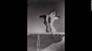
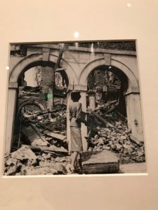
Horst (Mainbocher corset)
So I woke up to Vanessa Friedman’s preview feature on the Getty Museum’s Icons of Style exhibition in The New York Times on Sunday; and, as I read through it, wondered for a moment if we had lived through the same past decades (or perhaps more precisely if we had arrived at the same moment). She gets to the right conclusion—in fact she gets there right away, in the title/headline: “It Was An Ad? So What. It’s Still Art.” And with that ‘so what’ the hed encapsulates a subtle qualifier —in that it’s always smart to distrust an image with an agenda. In a way, this would have been the more interesting discussion—especially as we encounter it even more relentlessly in the world of on-line advertising.
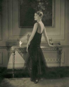 Instead, I meandered through a retread of a narrative and conversations that belonged to a generation (or two or three) prior to my own (which is going quite a ways back). In other words, it’s a conversation we might have had with Edward Steichen himself (who enters on the very early side of this survey). “[P]alpable tension around both disciplines [photography and fashion]” in the “hallowed halls of a museum”? It’s a fact that for those of us who revere great art and music, these places can be regarded as sacred spaces. But art doesn’t have to go through an embalming (or for that matter a varnishing) to enter the ‘hallowed halls.’ All it has to do is live eternally—emphasis on the live—because eternity just gets more abstract and more ephemeral with each passing year; and whether or not the art survives the civilization or the biosphere, it’s probably not going to fare too well in the next gallactic collision.
“Photography had to fight to get taken seriously, and fashion photography had to fight even harder,” Nick Knight is quoted saying; and again I wonder whose fight he’s talking about. Surely it’s not his own. He wouldn’t have the career he’s had if he were still ‘fighting the battles’ photographers like Steichen, Munkácsi, Man Ray and Lee Miller, Penn and Avedon had waged—and won (not without cost)—long before he dived in. And whatever Avedon’s qualms about his fashion photography being exhibited in 1970, he had certainly doffed that hairshirt by 1978, when his 30-year retrospective went up at the Met. There were the serious portraits against the stark white voids, the performers making something of their moment in more atmospherically lit studio space (or alternatively dropping their masks), the panoramic parades of Watergate scoundrels, Washington Post heroes and the Warhol Factory; and dancing (or swanning) through it all, the fashion photography. Could there be any question that there was as much art in the fashion photography as the portraiture and celebrity studies? You could have made a movie out of the Veruschka and Twiggy images alone. (And in a way Avedon already had—with a big assist from Mike Nichols—with his antic series of photographs of Suzy Parker and Nichols cavorting as Taylor and Burton-like celebrities hounded by papparazzi.)
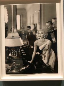
Richard Avedon, Sunny Harnett in Mme. Alix Grès evening dress, Casino Le Touquet, 1954
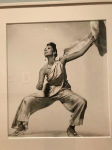
Richard Avedon, China Machado, Galitzine pajamas, 1965
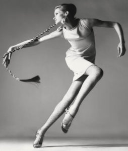
Veruschka by Avedon (Kimberly dress) 1968
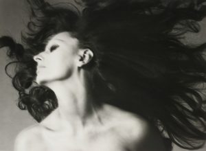
Avedon portrait of Sophia Loren with hair by Ara Gallant, 1970
Then we get an even more irrelevant retread of the kind of puritanism that once actually did infect not only the museum world, but the art world as a whole. (It’s still there to some extent, but most of us who have to hang out in that world try to ignore it.) This is a legacy that can be partially attributed to Duchamp and his particular strain of the Dada movement, trying to move the conversation away from its superseding aesthetic preoccupations toward a much broader intellectual scope; to break off the aesthetic carapace from the corpus of an idea and its extended implications. But even Duchamp recognized that between the perception and design—that is to say the idea itself—the aesthetic inevitably creeps back into the conversation. There’s a reference here somewhere to photographers preferring to refer to themselves as artists—which is probably true and further indication that the conversation has moved on. Fine art photography is rarely about simply the photograph. Something has been done to the photograph or to the process, or the ‘subject’ in its largest sense. The photography—the light, lens, performance, process, materials, etc.—itself is the subject. Or not—it can be part of a much larger performance, ensemble, assemblage, installation—the largest possible field imaginable.
The post-Conceptual legacy to art was that, even as artists felt free to return to very traditional media and craft traditions; also free to explore them entirely within or outside their cultural or historical contexts, they were similarly free to explore every new medium and technique available to them, to make art that required fresh theoretical perspectives, that made demands on language itself to do critical justice to it. We move in a world where art can take virtually any form and happen anywhere, whether crafted solitarily or collaboratively, quietly (or noisily) behind the doors of a studio, assembled by two hands or hired hands, or seemingly spontaneously erupt on the street – and I’m not necessarily talking about ‘street art’ either.
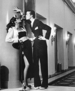
Helmut Newton, Yves Saint Laurent, “le smoking,” editorial feature for Vogue, 1975
So we’re still talking about photography being art? Really if there is anything even remotely controversial about this show it’s the notion of advertising design (or the photograph in service of advertising) being art or the vehicle of art. That is something I’m happy to see shaken off and confronted—and curator Paul Martineau has done this directly, including not simply the photography, but the entire graphic package. Beyond editorial fashion photography, which in the case of certain famous photographs (or a series of fashion photographs laid out as a ‘story’) effectively amounts to a full-blown advertising campaign (e.g., Helmut Newton’s photography of the Yves Saint Laurent le smoking looks in 1975), Martineau also gives us photographs that were in fact ads (although it’s interesting that we don’t necessarily remember them that way, at least not immediately—that’s how genius some of them were and are).
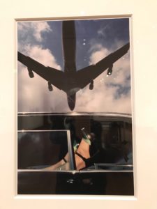 The pioneer and master of this genre was Guy Bourdin, who did not begin shooting fashion until the mid-1950s, but within only a few years was already pushing his style forward. It was as if he arrived at 1968 six or seven years early. There was always a surrealism to the Bourdin composition—he was mentored by Man Ray—and, as off-handed as they’re intended to come across, the images are all meticulously composed. Bourdin’s compositions are self-contained caches of surreal theatre, boxed interior or exterior spaces suggesting alternately compressed, oblique narratives, or obscure, almost recondite objects of desire. An intense alienation is held in suspense against a more amorphous sense of distraction that seems to diffuse through the subject, with only the frame holding it all in—a kind of visual ‘Situationism’ that gives a late-1960s edge to Bourdin’s surrealism. It was interesting to have an opportunity the following evening to look at a few series of small Polaroids Bourdin executed in preparation for a few of his fashion shoots. Within these very small dimensions, Bourdin holds his subjects as if they were insect or shell specimens. A Bourdin photograph offsets an avidity for the erotic impulse with a healthy contempt for his human subjects.
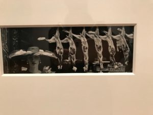
Guy Bourdin, “Chapeau choc” 1954
A Bourdin photograph—that is to say, a Bourdin advertisement—‘locks us in’ with our objects of desire (or contempt) even as it casts us adrift. The avenues of escape are all around us, but we’re helpless and trapped regardless. I’m not sure what kind of a filmmaker Bourdin would have made judging from the bits and pieces of Bourdin films I saw that evening at MILK Studios; but he would have been a perfect choice to direct a J. G. Ballard adaptation.
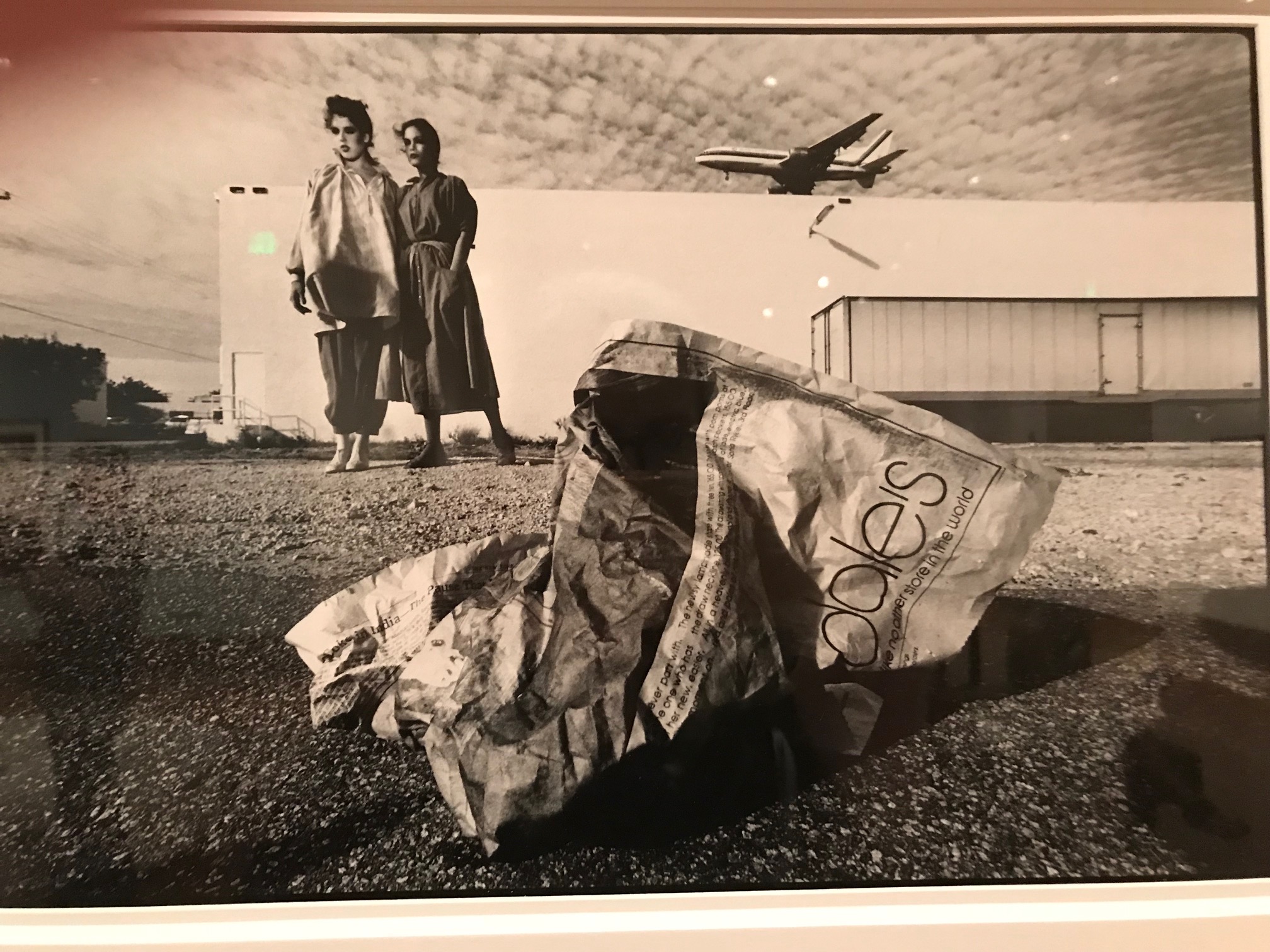
Consider his ad for Bloomingdale’s. We’ve seen this before and we’re seeing it now; though as the kids would say, the shit is getting real. The setting: exurban desolation, apparently a point of transit (La Guardia?)—we’re a long way from 59th and Lexington. Two figures are posed almost referentially—securely placed, but tentative in attitude—in the upper-left quadrant of the picture, half-way between a hangar-like white cuboid and the foreground. What looks like a cargo container disappears into the upper-right margins. They may be wearing fashion, but they’re not selling it. We might read them as travelers. A plane passing leftward some distance behind the site through a cirrocumulus scudded sky echoes this notion. The view is from an extreme low angle—call it a rat’s eye perspective—on a scrubby barren pavement of asphalt and gravel with the debris rolling towards us. (There may be a surveillance camera, though it’s hard to tell.) ‘Oh that’s what it is—a page from this morning’s discarded Times, with a portion of the crumpled advertising just visible—the clean Helvetica ‘-dale’s’ from ‘Bloomingdale’s’—the fishwrap that missed the fish. The ‘fashion’ is an afterthought. It’s all about the brand; and we’re in on the joke—it’s a part of the mental furniture and clutter we take for granted, like graffiti on the subway, the shmear on the morning’s bagel. Always moving, changing, decaying—until it’s not there anymore.
This is where the conversation is going—both in art and fashion. I refer to fashion here as design viewed within its contemporary actuality—the context of life itself.
Although its originality speaks for itself, Bourdin’s art here is directed to a fairly specific (though broad) audience and range of tastes within the culture of the American bourgeoisie. This was the state of American commercial culture in 1977, which regardless of its sophistication could be viewed on the same continuum as it had at the beginning of the 20th century; which is more or less the way it might be viewed today. We demand art of our goods and services—it’s essential to our culture and civilization.
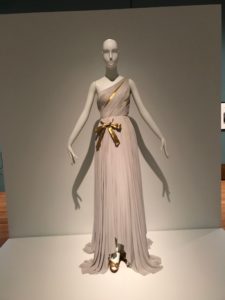 I loved that in addition to the actual commercial lithographic advertising or editorial art Martineau included some of the couture featured in some of the photographs, or similar designs. The classic evening dress Avedon photographs on Sunny Harnett by Alix Grès at the Casino, Le Touquet in 1954 is here, as is another famous Dior day dress and hat photographed by Avedon in 1947. Yet Martineau felt compelled to undergird his discussions (he’s authored two essays in the catalogue) with a kind of ‘ars longa, vita brevis’ preamble and foundational chronology. The epigraph to his introduction is a characteristically epigrammatic (and disingenuous) quote from Oscar Wilde’s essay, “The Philosophy of Dress.”
“Fashion rests upon folly. Art rests upon law Fashion is ephemeral. Art is eternal. A fashion is merely a form of ugliness so absolutely unbearable that we have to alter it every six months.”
This was rich, coming from Wilde; and he knew it. (Though between reading Friedman’s Times piece and looking at the exhibition the following day, I paused to consider the gulf between law and theory in different disciplines.) Civilization rests upon law—which, as Americans know too well, often itself rests upon folly. Art and fashion both rest upon theory; while both are frequently driven by folly. Art may or may not be eternal; but it is more likely than law or fashion to survive the civilization that nurtured it. If you ever return to that essay with a view to the fashion of the last few decades, you’ll wonder if Wilde was simply waiting for designers like Chanel, Cardin, Courrèges, and Calvin Klein to come along. And to be photographed by, say, Herb Ritts—the subject of Martineau’s 2012 exhibition of fashion photography.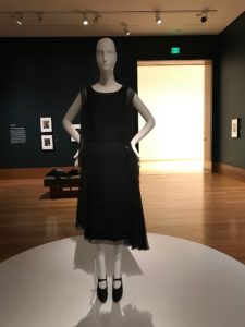
Ritts belonged in the Getty then just as he does now, surrounded by his fellow laureates; and so does the work of Cardin, Courrèges and Calvin Klein. Setting to one side the sophisticated languages and ‘systems’ (as Barthes once analyzed it) of fashion, couture and fashion design are about an architecture for the body that moves with the body. But fashion is also much more. It occupies a space between art and life. It’s about what happens around that architecture, mediating between role or identity and culture. It’s inherently aspirational. It’s about the atmosphere we create around ourselves; an approach to life and the way we want to live. The photography inevitably reflected and magnified this. Avedon summed it up perfectly in his 1963 tribute to Munkácsi: “The art of Munkácsi lay in what he wanted life to be, and he wanted it to be splendid. And it was.”
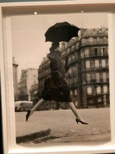
Richard Avedon, Carmen (“Homage to Munkácsi), coat by Pierre Cardin, Place François 1er, Paris 1957
But aspirations can fail. Or they can succeed in one moment only to fail in the next. Once one of the most successful and wealthiest of commercial photographers, Munkácsi’s life ended in almost catastrophic poverty. We live in a time of fallen and failing icons, where even the designation, ‘iconic’, seems increasingly debased and devalued. (Or simply tentative or temporary: we recognize certain things as iconic by definition, but realize they may not hold that status through more than one or two generations.) Monuments fall almost routinely; and if civilization hasn’t quite fallen, we’re seeing cracks as terrifying as those in the Antarctic ice shelf (Syria, Turkey, Hungary, Washington, D.C.)—and it could be said the two are not unrelated.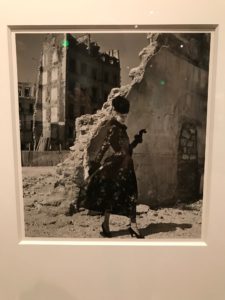
Martineau was smart to close off the survey at 2011—the dawn, as he puts it, of Instagram and yet another culture of image-making that has sprung up around it. I was slow to see this shift myself; it surprised me more than a little that the curators of the 2014 edition of Cincinnati’s FotoFocus made it the physical centerpiece of their photography biennial. The speed and decay of fashion trends is yet another pressure point with consequences that may or may not have been foreseen, the most significant of which is simply over-production and waste (with the predictable environmental fall-out). The larger implication of disposable fashion in our late capitalist economy is that it implies disposability at both ends of the production chain: the workers who produce it and the product itself, which ends up as more than slightly toxic trash. It is the antithesis of the aspirational.
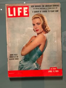 At a moment when contingency and conditionality increasingly define the way we live, the ‘icons’ themselves blur. The Icons show is large enough that, ‘iconic’ or not there may be images that fade to footnotes. (And it’s not as if there aren’t a few notable misses here: e.g., under-represented Italian fashion and fashion photography and Hollywood film costuming and its photography.) But aside from the presentation of advertising images, what seemed almost breathtakingly audacious, given the exhibition’s broader foundational reticence, was the inclusion of the actual commercial lithographic and photomechanical packaging: magazine covers—not in vitrines or flat-file displays, but on the walls, directly alongside the platinum prints. One of these is the LIFE Magazine cover that featured Grace Kelly in the ice-blue duchesse-satin gown by Edith Head she wore to accept her 1955 Oscar for The Country Girl. The other is the cover of the October 2011 S Moda (the style/fashion magazine of the Spanish news organization, El País) featuring a fashion model then on his way to supermodel status, Andrej Pejić. The cover line: “¿Hombre o Mujer? El estilo no entiende de sexos.”
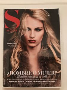
No kidding—nor, we might add in 2018, just about any other distinction. Pejić famously transitioned to Andreja a couple of years later. But that moment, too, had its own iconicity—when we embraced the blur. By framing the ephemeral souvenir, Martineau makes a concrete demonstration of that new superlative—the ‘transitory iconic’. It can safely be assumed that many thousands of similar magazine covers—LIFE or S Moda—were destined for trash heaps and recycling. But even the stars are destined to die.
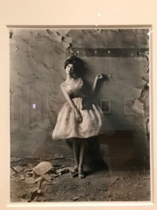
Melvin Sokolsky, Simone, “Ecstasy” 1960

