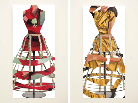
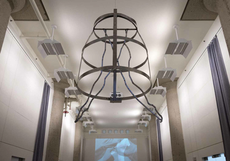
Last week I ventured to the Cooper Design Space in Downtown LA’s fashion district to see the “15 CalArts MFA Show.” It is a large inconspicuous building surrounded by cut-rate fabric stores typically used for designer showcases—a somewhat irregular location for an art exhibition. However the shift from fashion to fine art was well facilitated by a Kimberly Brooks installation on view in the lobby. Titled “Thread & Bone,” it explores the parallels between painting, fashion design and the industrious structure of the building itself through a series of collages, video and a huge steel hanging sculpture. The printed collages that line the walls of the lobby use photographs of figurative detail paintings by Brooks herself to create the fragmented contour of a gown, drawing a deliberate connection between painting and textile. It provided the perfect middle-step between the outside environment and the MFA show I was headed to see.
Upon entering the gigantic exhibition space from tumbleweeds to Facebook profile collages—these MFA students have it all— at first my eye did not know what to focus on. Although a painting by Hannah Plotke caught my attention. A beautiful tension occurs between the artificial and natural through its dualities of neon-colored paint and muddy sand. The canvas is covered in a mixture of abstracted bright shapes and cartoon-like depictions of human faces and bodies.
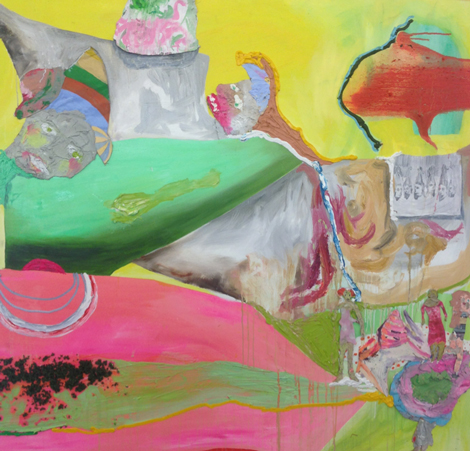
Hannah Plotke, “The Guests Hardly Slept at all but Spent the Night Playing Practical Jokes on One Another”, 2015, oil on canvas, (detail)
Another highlight is Tasha Bjelic’s “Bathroom Address,” which consists of three framed sheets of paper, the first labeled as Bill Clinton’s Address to the American People at the Kosovo Intervention, and the second two labeled as her own “bathroom” address in the same format. Both of these “addresses” are made up of two columns that list things under the label of “friend” and “enemy.” Clinton’s address appears to be entirely political, listing things like: defenseless people, Europe, and peace, under the friend column, and “Serbian forces:” brutality, etc., as enemies. Bjelic’s friend and enemy lists on the other hand are made up of more mundane, relatable qualities like: tingle from head to toe, make-up and bad breath. This work seems to touch upon the common disconnect political issues and everyday life because it is easier to connect with and feel emotions toward the trivial items listed in Bjelic’s address than Clinton’s.
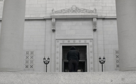
Andre Daughtry’s video Cathedral is another notable work. It is made up of four different accounts, told through voiceover, while a camera follows an unidentified black male going up and down an escalator—the character changes with each account—of problematic situations for blacks in Los Angeles. These stories are interspaced with poignant shots of each respective character interacting with a monument in Downtown LA. My favorite of which was the character spinning around in graceful dance at the police station.
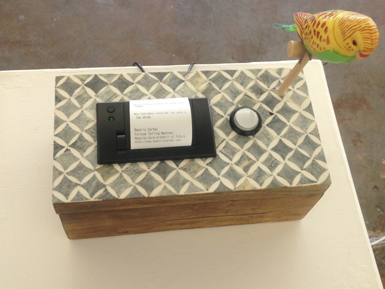
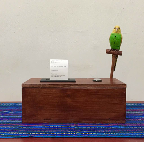
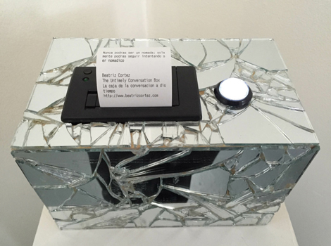
The showstopper for me was a series of four interactive receipt makers by Beatriz Cortez. Each machine has a button that when pushed releases a receipt bearing a message that the viewer is invited to tear off and read. Some of the messages read like fortune cookies: “Have a willingness not to be—resist the lure of identity.” While others simply say: “what’s up?” Though the machines are uniform in function and size, two look like kitschy vintage boxes with plastic parrots that animate with the button-push, one is covered in broken glass, and the last is completely transparent. I don’t know if there is any significance in the messages themselves or the nuances of each machine’s exterior, but I think it’s an innovative idea that successfully combines the common art themes of robots (or technology in general,) kitsch, and consumerism in a fresh, new way.
This CalArts MFA exhibition curated by Sarah Lehrer-Graiwer left me feeling curious and hopeful for the future careers of this eclectic and bold group of emerging artists. Many show a great deal of promise and I look forward to seeing their works out there (if they aren’t already!)

