


A long banner of colorful flowers fills the second floor window of 1301PE. Seen from the outside, it functions as a precursor to the works inside the gallery. It is also serves as a memory trace; upon entering the second floor space one is thrown into a quandary— nothing is as it should be. Eight vertical high definition video monitors surround the space, each depicting an isolated image of those same flowers, some in close-up, and others as small arrangements. Removed from a black mask that covers the upper part of the screen, above each flower is the name of a color in the video spectrum—red, green, blue (primary), cyan, magenta, yellow (secondary), purple, orange (tertiary). In each monitor, the name of the color does not correspond with the color of the flower(s) in the image.
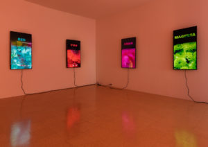
Diana Thater, “Colorvision” (2016). Installation view, 1301PE, Los Angeles. Courtesy the artist and 1301PE. Image by Fredrik Nilsen.
“Colorvision“ (2016) is a thought provoking and engaging installation whose premise is based on a neurological test—the Stoop Effect—that investigates the speed of the brain’s ability to recognize color versus encode words. Thater states her interest in the dissonance experienced when viewers are ” shown one color but asked to read the name of its opposite,” asking, “Does reason or sensation dominate our experience of art?”
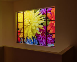
Diana Thater, “Colorvision” (2016). Installation view, 1301PE, Los Angeles. Courtesy the artist and 1301PE. Image by Fredrik Nilsen.
While scientifically and theoretically based, as much of Thater’s work is, “Colorvision” poses but does not answer complex questions about vision, language and memory. The key to the exhibition is the backlit banner that covers the windows. Here the garden flowers are presented as they should be; however, in each of Thater’s video depictions neither the word nor the image is a true representation of this reality. For example, in Colorvision Purple, the letters PURPLE cut from a black mask, reveal flowers with an exaggerated orange tint quivering in the drizzle. If one takes in the letters that spell out p-u-r-p-l-e first, the brain processes this as wrong because what the eye sees is orange not purple. Looking at the image first, and then reading the word, also produces a disconnect. Like the question, which came first the chicken or the egg, Thater’s work is a visual investigation of circular thinking—Is it purple or orange? Is it neither or both?—that suggests that when it comes to art, the tension between reason and sensation is unresolvable.
Diana Thater, “Colorvision” September 17 – November 5 at 1301 PE, 6150 Wilshire Boulevard, Los Angeles, CA www.1301pe.com
