


You probably know Brian Rea’s work even if you’re not familiar with his name. In fact, it’s probable that you do know his name by now because his illustrations seem to be almost everywhere from book jackets and frontispieces to half the magazines you pick up, and even tote bags. Like somewhere near half the world, I first saw his work in the pages of The New York Times, where his wise-childlike drawings first began to regularly accompany the Modern Love essays that appear in the Sunday Styles section of the Sunday paper. I almost stuck in a ‘deceptively’ before that ‘wise’ – but there’s no deception in a Brian Rea drawing, only purity and a kind of grace. I realize that could, in itself, be read as a kind of deception or diversion. But in Rea’s illustrations it reads as a kind of lightness, transparency, and, for the Modern Love essays, a moment of resolution or denouement – even for a situation that remains prickly and unresolved – as many of these modern ‘romances’ can be. (And even the most casual reader of these Times essays will know what I’m talking about.)
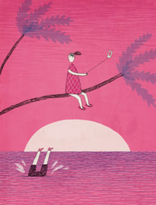
from Modern Romance for October 23, 2016 New York Times
There is also a kind of equipoise Rea’s illustration excels in describing. Contemporary life involves a fairly constant negotiation of situations that immediately present themselves as dilemmas, but in Rea’s spare renderings there’s a kind of clarity that is immediately calming, neutralizing. They reassure us: the equation may be complicated, but we will solve for x and y, plot the curve and get ahead of it one way or another. In other illustrations, Rea illustrates a kind of ‘turning-point’ where the ‘curve’ might (‘axially’) shift – the merest shift of a line, of one of his slightly oblong bubble heads (which usually have no necks and more often than not practically float above the trapezoid/parabolic bodies of his figures). We can see why he would be the perfect illustrator for something like Malcolm Gladwell’s Blink.
Where there is no ‘resolution,’ poise and balance persist – usually by multiplication: Rea is a master of a kind of inventory illustration (and indeed, the inventory genre generally). In this regard, Rea’s pure, unbroken, sometimes almost continuous line reminds me a bit of Saul Steinberg, though Steinberg usually liked to whip his cosmopolitan repertoire of graphic styles into a lively and whimsical mix. Elsewhere Rea’s style sometimes reminds me of Edward Koren, substituting Koren’s quavery, hyperactive scribble with superflatness and space (literally: I’m thinking of the illustration of two men on a park bench, one of whom has his ‘head in the clouds’ – the top of the head is omitted altogether). Inevitably, Rea’s drawings and illustrations have found their way into The New Yorker.
Rea’s illustration style draws on a number of antecedents – inventory styles generally, artists like Steinberg, mid-20th century modern graphic stylists, from Saul Bass to Charles and Ray Eames, and the Japanese Superflat movement of Aoshima and Murakami. You might almost sum up his figure style as the ‘stick figure grown up and gone Superflat’ – except it’s even flatter than that: transparent, weightless – the transparent paper doll. The features are minimalist graphic – the nose a quasi-pyramid or broken triangle, the ear a parenthesis and plus-sign (if that). The line is pure and unemphatic; even densely shaded passages tend to be relatively light and smooth; sometimes just a dense thicket of short straight lines, or bundles of tiny circles. There’s a pictogrammatic quality to some of his figures, shapes, and entire illustrations. His biomorph-geometric trees, ‘woods’ or ‘forests’ (though I can only imagine a Rea forest of such linear thickets) are frequently all-over patterns of leaves, streamlined trees and plants reminiscent of actual mid-20th century wallpaper patterns.
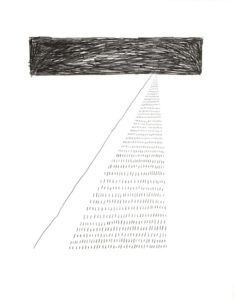
Untitled #10 (2013), graphite on paper, 14×11 in.
Recently we have seen Rea move from editorial or commercial illustration in a direction merging idea and drawing (and frequently words) that goes beyond graphic illustration and into the realm of fine art. (I’m thinking, particularly, of an illustration that became a painting on a panel, PAIN (internal) – A one year inventory, a starburst of slender word bubbles (e.g., ‘FEARS,’ ‘Burning Inside,’ ‘Tear Jerkers,’ ‘Feeling Old’), or an animation he produced for California Sunday Magazine.)
PAIN is included (along with another image that appears to be its graphic inverse) in a show of work by both Rea and Yong Sin, entitled Whispers & Echoes, currently on view at CMay Gallery at the Pacific Design Center through October 28th.
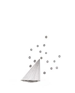
Untitled #7 (2013)
Here, the pictogrammatic aspects of Rea’s illustrations are blown up into something like image-object lessons – not dilemmas, per se, so much as philosophical conundrums: phenomenological juxtapositions, intractable oppositions, seemingly contradictory, paradoxical states. (The Times Modern Romance page had to be great preparation for that.) There’s an element of ‘flip’ in the show (which may be a Rea trademark) that extends in literal terms from the more illustrational drawing, Backflip, to a sculptural installation (!) of polished river stones, inscribed with words or phrases like, ‘great sex,’ ‘figuring it out,’ ‘Champagne,’ ‘puppies,’ and ‘holiday’ – naturally titled, Happiness. No contradictions there.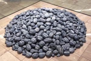
I’ll have to hold my comments on Yong Sin’s work for another post; but by all means try to see this show if you’re in the Pacific Design Center neighborhood in West Hollywood. It closes at the end of this week.
There’s a second part to this post – an extension of this ‘horizon,’ and still another set of dilemmas – the work of another illustrator (also an architect) I happened to rediscover around the same time I stumbled into this show; but that, too, will have to wait while I sort out the star beams of pain from the stones of happiness.


0 Comments