The Venice Biennale, founded in 1895, now includes 30-plus national pavilion spaces in the Giardini area, a mindboggling abundance of ancillary exhibitions (including especially the group show in the warehouse-like Arsenale), as well as a plethora of performance art, music and theater. No one can see it all. For that reason, any viewer response—including this one—is bound to be not only personal but also lamentably partial. What follows is a description of the exhibitions in some of my favorite pavilions and one that I consider remarkably unsuccessful.
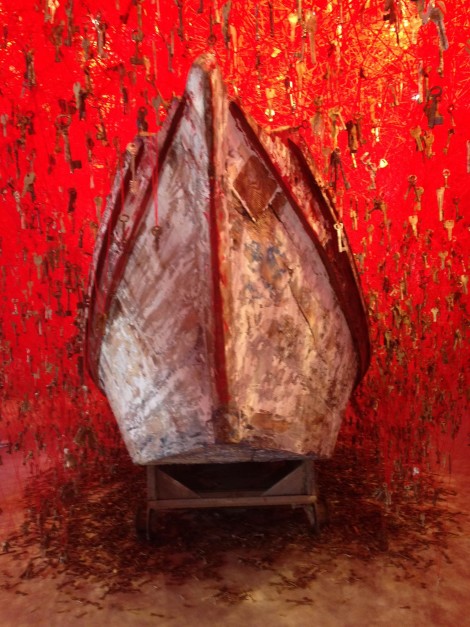
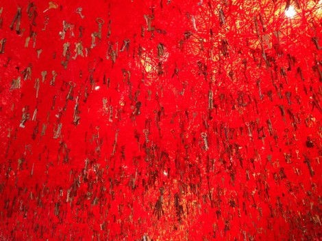
My number one favorite—and I am certainly not alone in this—was the beautiful and profoundly affecting work in the Japanese Pavilion. Artist Chiharu Shiota created a complex installation entitled “The Key in the Hand.” She filled the main room of the pavilion with thousands of strands of red yarn that stretched across the space to create a dense web of succulent color. Then she hung a single metal key from each strand. The lush curtain of red yarn and suspended metal keys seem to erupt from (or cascade into) an old rowboat. Many of the keys are antiques, carrying nostalgic echoes of past times. I read them as expressive symbols of lost lives. (As it happens, curator Hitoshi Nakano informs us that Shiota has converted her experience of the deaths of friends and family “into the lingua franca of pure and sublime art without averting her eyes from the reality that all human beings must face ‘life’ and ‘death’ but that each of us must do so individually.”) The lost life symbolism is underscored by the pulsing vitality of the blood red as well as the distressed wooden boat, which recalls the one Charon used to cross the River Styx. References to death can be unrelentingly dark, but Shiota’s work embodies a radiant spirituality that shines beyond such darkness.
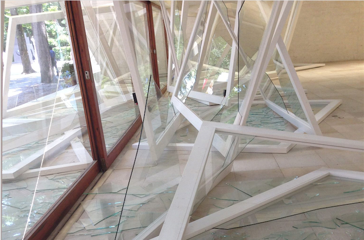
Another favorite was the Nordic Pavilion. Norwegian artist Camille Norment created an installation that includes sound and sculptural components. A large ring of tubular speakers hangs from the ceiling, sending abstract sounds echoing through the room. Stacked all around are wooden window frames, their glass panes shattered into angular shards. The austere, meditative minimalism of Norment’s sound sculpture alludes to poetic connections that can only be absorbed by quiet minds. I thought about how some musical notes can break crystal…and also about the practice of sound healing.
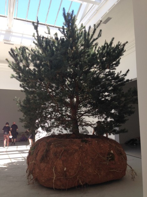
The French Pavilion similarly insists on silent, calm contemplation. Artist Celeste Boursier-Mougenot’s “revolutions” involves three large pine trees, the mud encasing their root balls, and (invisible) motors that make them rotate so slowly that the movement is almost imperceptible. Boursier-Mougenot situated two of the trees outside the pavilion, where they almost blend in with the surrounding landscape. The other tree is located inside the central room of the pavilion. Three flanking rooms are filled with comfortable stadium seating, transforming the pavilion into an open-air theater. Viewers can sit—indeed lounge—and watch the tree revolve under the skylight canopy. Like a movie, viewers are immersed in a shared dream, in this case an animist dream of plants gently merging with machines.
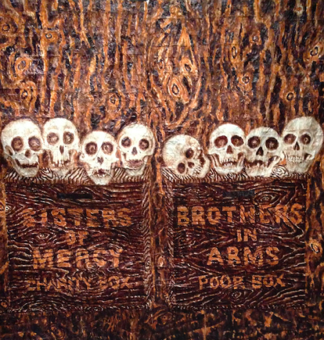
At the Australian Pavilion, artist Fiona Hall used remarkably diverse mixed-media to create politically potent commentary on contemporary warfare. In a complex installation she calls “Wrong Way Time,” Hall addresses the intersection of global politics, world finances and the environment. She feels these constitute “a minefield of madness, badness and sadness.” The center of the pavilion is occupied by a “troop” of figures whose enlarged features, cowry shell eyes, and shriveled skin resemble shrunken heads. Their bodies are composed of remnants of military fatigues—the heads are woven from tiny strips of camouflage material. Framing the “troop” are four glass vitrines. One is filled with circular nests made up of shredded U.S. dollars. Another display case is lined with currency from diverse countries (Haiti, Uganda, Zaire, etc.), all covered with red spermatozoa that appear to swim over the surface of the flattened bills. As a whole, Hall’s installation resembles an anthropology museum, like the Musee de l’Homme in Paris. One of Hall’s themes is the fact that warfare is a very male-dominated practice. There is a two-part painting at the entry to the installation that reads “Sisters of Mercy Charity Box” and “Brothers in Arms Poor Box.”
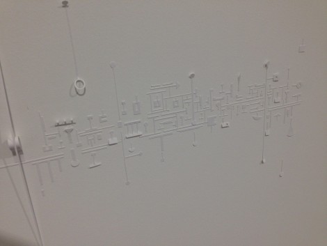
I traveled to Venice with my son, whose favorite piece was Marco Maggi’s “Global Myopia” in the Uruguayan Pavilion. The cavernous white space seems empty at first…but on closer inspection, the walls are covered with tiny pieces of carefully cut white paper. The fragile pieces of paper are glued down, with occasional parts folded to angle out from the flat surface. The shapes are reminiscent of a computer motherboard, but rather than appearing machinelike, they have a subtle, almost lacey appeal. Maggi’s elegant paper mosaic made me think of the subliminal presence of the digital technology in which we are immersed.
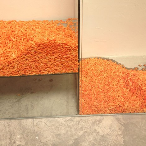
Mat Gleason titled his 1998 book, Most Art Sucks and alas, some of the art at the Venice Biennale really did suck. For me, the suckiest was the Spanish Pavilion. According to the Pavilion website, the collaborative team of artists intended to present “a critical approach to [Salvador] Dali…based around the idea of multiple identity.” Dali and identity politics? The idea sounds a bit forced to me… And then there is the work itself: One component is a wall of Cheetos sandwiched between slabs of clear acrylic. Seriously? What do Cheetos have to do with Dali and/or identity? Realizing I might have been ignorant of some historic relationship, I googled “Dali & Cheetos.” The only connection I found was on the website for Goodby Silverstein & Partners. GS&P designs interactive apps, including, most recently, an app for newly shaped Cheetos, as well as an app for the Dali Museum. Surely that random status on a client list isn’t enough to inspire serious art. But there they were, thousands of Cheetos in an installation that was supposed to explore Dali and identity. I kept reaching. Maybe the Spanish artists thought that the shapes of the new Cheetos were reminiscent of Dali’s signature melting watches? That association is so contrived it’s just silly. In the end, I concluded that the art in the Spanish Pavilion was ridiculous…and not in any of the interesting ways that Dali was deliberately ridiculous in the 1930s and ’40s. Sigh. I still have no idea what Cheetos have to do with identity.
On the flight home, an older man in cool glasses saw I was carrying materials from the Biennale and went into a rant about how awful it was. I figured he must have started with the Spanish Pavilion and shut his mind as soon as he saw the Cheetos. If that’s the case, it’s a shame. Yes, some of the Venice Biennale sucked. And I’m sure the guy on the plane was not alone in his overall negative assessment. But so much of the Venice Biennale art was so good that I’m already wondering how I can get back in two years. If I do, I’ll make a point of giving myself a lot more time to see a lot more of the extraordinary exhibitions.







0 Comments